Newsletter Subscribe
Enter your email address below and subscribe to our newsletter

 ByJohn A
Open five websites. Scroll through three social feeds. Look at a row of new app icons.
You may notice something strange. Different companies often use the same colors, the same rounded buttons, the same clean illustrations, and almost the same words.
The internet has never offered more creative tools. Yet much of it feels increasingly familiar.
This does not mean designers have stopped having ideas. It means the systems behind modern content often reward safe, repeatable choices. Understanding those systems can help anyone create work that feels more original without making it confusing.
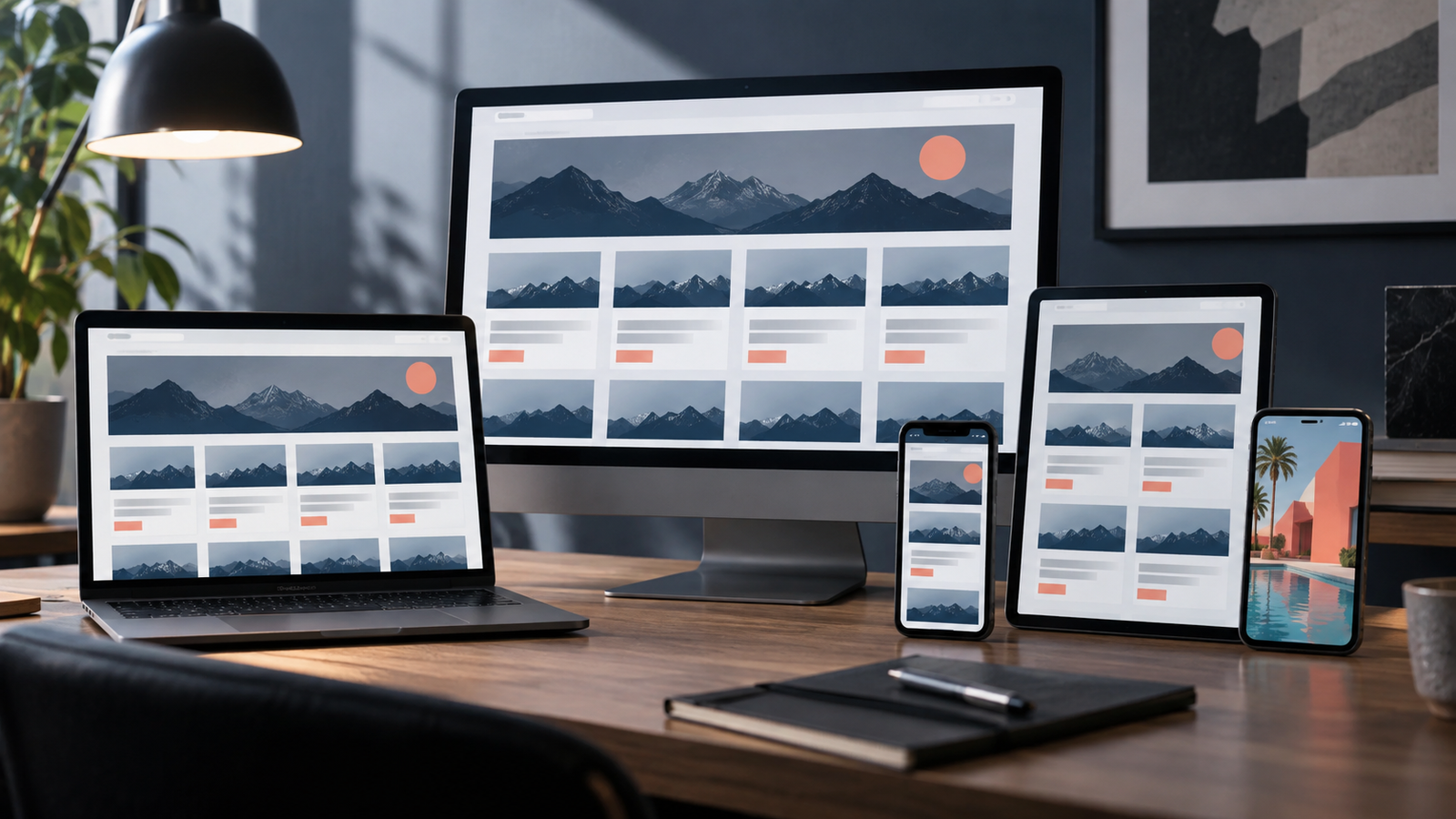
Templates solved a real problem. A small business no longer needs a large design team to create a clean website. A student can build a polished presentation in an afternoon. A creator can publish attractive social posts without learning professional software.
That access is valuable. But popular templates are often used with only minor changes. The logo changes. The photo changes. The layout does not.
When thousands of people begin with the same structure, different brands can end up looking like variations of one product.
Every platform has its own rules. A profile image must fit a certain shape. A video should work in a vertical frame. A caption is shortened after a certain point. A thumbnail must remain clear at a small size.
Creators adapt because these limits matter. Over time, the most effective formats get repeated. Big text appears at the top. Faces are cropped closely. Short videos open with a surprising statement. Bright colors mark the important detail.
These choices are not automatically bad. They often improve clarity. The problem begins when the format becomes more memorable than the idea.
People repeat what appears to perform well. If one type of headline gains attention, similar headlines soon appear everywhere. If a certain video style travels quickly, more creators copy its pacing and structure.
This creates a loop. Platforms reward a pattern. Creators repeat it. Audiences become familiar with it. The pattern then feels like the safest choice for the next post.
The result can be efficient but predictable. A person may understand the content quickly while feeling that they have already seen it before.
Artificial intelligence can help people explore ideas, create drafts, and work faster. It can also produce very similar results when everyone gives it similar instructions.
Requests such as “make it modern,” “use a clean layout,” or “write an engaging introduction” tend to pull toward common patterns. The result may be technically polished but lack a specific point of view.
Better inputs produce more distinctive work. Real examples, clear constraints, personal observations, and knowledge of the audience give creative tools something meaningful to work with. AI is most useful when it develops a human direction rather than replacing one.
Color trends once moved mainly through fashion, magazines, advertising, and interior design. Today, a popular palette can spread across millions of screens in weeks.
A successful app may inspire a wave of soft gradients. A new product category may make one bright accent color feel modern. Design libraries also make it easy to reuse complete palettes.
Trends help a design feel current, but they can weaken recognition when everyone follows them. A better approach is to choose colors that fit the message, audience, and context. A distinctive palette does not need to be loud. It needs to be consistent and intentional.
Many websites use the same small group of readable digital typefaces. There is a sensible reason for this. Familiar fonts load well, work across devices, and remain clear at different sizes.
But typography carries personality as well as information. Letter shape, weight, spacing, and contrast can make a message feel calm, playful, serious, technical, or personal.
Type the same phrase into Fontalic.com and the effect becomes obvious. Rounded letters may make it feel playful, while sharper forms can make it feel more direct. That quick comparison is useful when shaping a headline or social graphic. Whatever the style, it still needs to remain clear on a phone.
Visual sameness is not limited to layouts. Stock photography often uses familiar scenes: people pointing at laptops, perfect desks, staged meetings, and carefully arranged coffee cups.
These images are convenient, but they may say little about the real subject. Original photography is not always possible. Even so, a specific crop, an honest environment, a real object, or a simple diagram can communicate more than a generic business scene.
The question is not whether an image looks professional. The better question is whether it adds information or feeling.
See also: The Brief You Should Have Written Before You Opened the Design Software
People rely on familiar patterns to use websites and apps. They expect navigation near the top, buttons to look clickable, and forms to behave in predictable ways. Breaking every convention creates frustration, not originality.
The goal is to keep the parts that help people and rethink the parts that express identity.
A checkout should remain easy to understand. A headline, illustration style, tone of voice, or color system can carry more personality. Originality should improve recognition without making the experience harder.
Start with a point of view, not a template. Decide what the audience should feel, learn, or remember before choosing a layout.
Use specific material. Real customer questions, personal observations, local details, original examples, and firsthand images are difficult to copy because they come from a particular experience.
Limit your creative system. A small set of colors, type styles, image rules, and writing principles can produce a stronger identity than a collection of unrelated trends.
Finally, review the work without the logo. If it could belong to almost any brand or creator, one more distinctive element may be needed.
Much of the internet looks similar because people use the same tools, respond to the same platforms, and follow the same successful patterns. Those forces are unlikely to disappear.
Still, originality does not require rejecting every template or trend. It comes from making deliberate choices and filling familiar structures with specific ideas.
The most memorable work is not always the strangest. It is the work that feels clear, useful, and recognizably connected to the person or organization behind it.