Newsletter Subscribe
Enter your email address below and subscribe to our newsletter

 ByJohn A
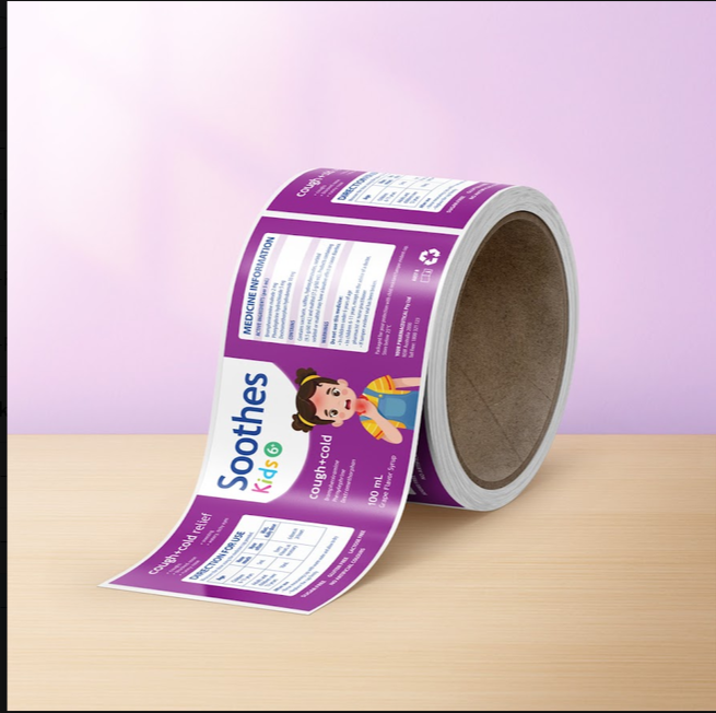
Most label projects start in the wrong place. Someone opens design software, picks a typeface they like, and starts nudging shapes around the screen. Two weeks later, the artwork looks lovely as a flat file and falls apart the moment it meets a curved bottle. Label printing Australia has moved almost entirely online, which makes that shortcut easier than ever to take. The software is right there. The brief, the boring part, never gets written.
A brief is just a page of decisions made before the pretty work begins. It answers what the label sticks to, how big it can be, what it must legally say, and how many you need. Label printing Australia runs on those four answers. Sydney businesses that write them down first tend to order once. The ones who skip it often pay twice.
Your label does not exist on its own. It lives on a bottle, a jar, a pouch or a tin, and that object decides most of the design for you.
Measure the container’s flat area. Not the full circumference, but the part that stays flat enough for a label to sit without wrinkling. A 500ml drink bottle with a strong taper will reject a wide rectangle that looked perfect in the file.
Write down three things before anything else:
Those three lines will save more time than any amount of redesigning later.
See also: What Is a Seed Phrase in Crypto?
Material choice is where guesswork gets expensive. A gin bottle that sits in an ice bucket and a jar of coffee beans on a dry shelf need different answers.
Polypropylene handles moisture. Think cold drinks that sweat in a fridge, or a serum bottle that gets handled with wet hands in a bathroom. It resists water and scuffing. Put plainly, polypropylene is built for indoor and product use, not outdoor signage or anything exposed to weather for months.
Metallic silver stock gives you a reflective base, so colours printed over it take on a foil-like look without any extra finishing.
Pick the material against real conditions. Where is the product stored, shipped, and used? Answer that honestly, and the choice usually makes itself.
Quantity changes the shape of your whole decision. Ordering 200 labels for a market run and ordering 5,000 for a wholesale order are different projects, even with identical artwork.
Because labels are printed to order rather than pulled from stock, you are not forced into a huge minimum to make the maths work. That cuts both ways. It also means nobody is holding a spare box for you when a batch goes wrong.
Note your order quantity, your reorder timing, and whether the product name or volume is likely to change in the next six months. A brief that anticipates a flavour variant is worth more than a brief that assumes nothing will ever change.
Regulated products carry compulsory information, and it eats space. Food and drink labels in Australia carry ingredient lists, allergen statements, volume or weight, and supplier details. Alcohol adds its own requirements. Cosmetics have their own rules again.
Designers who receive this text late end up shrinking it until it barely reads. That is the most common revision request in the whole category.
Gather the compulsory copy first. Paste it into your brief as plain text. Count the characters. Then design around it, rather than squeezing it into whatever space is left at the end.
Plenty of good designs stall at upload because of file setup, not creative choices.
Your brief should state the technical basics so the designer works to them from the start:
Templates are available to download before you begin. Starting inside one removes a whole category of problems.
Nobody enjoys writing a brief. It feels like admin standing between you and the interesting part. But the businesses that get labels right on the first attempt are rarely the ones with the best design skills. They are the ones who decided what they needed before they started drawing.
Write the page. Then open the software.